How to Use Branding Guides to Improve Conversions
How to Use Branding Guides to Improve Conversions
A branding guide does more than keep logos and colors consistent. Learn how to apply brand guidelines to landing pages, messaging, CTAs, and customer journeys to support better conversions.


Every small business owner dreams of turning visitors into lifelong customers. But in today’s competitive online marketplace, the difference between standing out and blending in often comes down to how well you manage your brand. This is where branding guides come in. By creating and using a branding guide effectively, you can build trust, unify your message, and, most importantly, drive conversions. Here’s a practical guide for doing just that.
How to Use Branding Guides to Improve Conversions
A branding guide can make your business look consistent. But matching fonts and colors will not, by itself, persuade someone to buy, book, or request a quote.
To use brand guidelines to improve conversions, apply them where customers make decisions: the message that brings them to your website, the page that explains your offer, and the next step you ask them to take. Clear positioning, recognizable design, useful information, and consistent expectations can reduce confusion. Then you need to measure whether those changes actually help people act.
What a Branding Guide Can Actually Do for Conversions
A branding guide is a documented set of standards for how a business looks, sounds, and communicates. It often includes logo rules, colors, typography, imagery, tone of voice, and messaging. A more useful guide also explains the brand’s positioning, audience, and the promises it can credibly make.
Those foundations matter, but they have a different job from a conversion strategy. Guidelines help people recognize your business and understand what to expect. Conversion rate optimization (CRO) examines what happens when someone considers taking an action, such as purchasing a product or completing a form.
The connection is the customer experience between those moments. If a social ad promises a simple consultation but the landing page looks unfamiliar, describes a different service, and asks visitors to complete a lengthy form, the problem is not merely inconsistent branding. The business has created uncertainty at the exact moment it needs clarity.
For a fuller breakdown of the document itself, start with what a branding guide should include. The focus here is how to put those standards to work on customer-facing experiences.
Set Brand Rules Around the Decisions Customers Make
Logo placement and HEX codes are necessary production details. They are not the whole story. To support conversions, a guide should help the team answer practical questions: What is the main promise on this page? What proof supports it? How do we explain the offer? What should a customer do next?
Include standards for the visual identity, but connect them to communication:
- Positioning and value proposition: Explain who the business serves, which problem it solves, and what makes the offer different.
- Visual identity: Define logo variants, colors, typography, imagery, and examples of correct use on small screens and different backgrounds.
- Voice and terminology: Show how to describe services, handle objections, and communicate in different situations. Include examples, not just adjectives.
- Trust and evidence: Establish standards for accurate testimonials, credentials, guarantees, and product claims.
- Calls to action: Document preferred language for booking, requesting estimates, shopping, and other real customer goals.
These rules should help someone build a clearer page without having to ask which shade of blue represents the company’s personality for the fifteenth time.
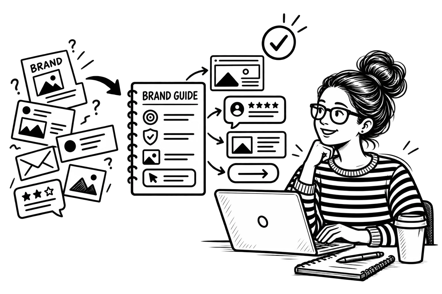
Connect the Ad, Landing Page, and Next Step
Consider a hypothetical local coffee shop promoting a weekend tasting. Its social post shows the event, uses the shop’s recognizable style, and invites people to reserve a spot. If the linked page features the same event name, date, recognizable identity, and an obvious reservation option, the visitor can pick up where the post left off.
If that link opens a generic homepage instead, with no mention of the tasting, the visitor has to start searching again. Matching colors would not fix the missing information. Brand consistency helps people recognize that they reached the right business; message continuity helps them confirm they reached the right offer.
Apply the same principle to service businesses. If an advertisement promises an estimate, the destination should explain what the estimate covers and how to request one. Use familiar terminology across the ad, page title, and form. Our guide to aligning website design with brand identity explains how the visual and verbal parts should support each other.
Use the Guide to Make Service and Product Pages Clearer
A service page needs more than a polished header. Visitors should understand what is offered, who it is for, which details matter, and what happens after they contact the business. A branding guide can standardize how those answers are presented without making every page sound identical.
For example, a home services company might define an approved service description, a consistent approach to showing completed work, and straightforward language for booking requests. Its team can reuse the same standards across landing pages while still answering questions unique to roofing, repairs, or installation.
Trust also depends on information, not decoration. The Nielsen Norman Group’s research on ecommerce trust and credibility addresses factors such as professional presentation, company information, and product details. A recognizable identity can support confidence, but it cannot replace accurate prices, clear conditions, or proof that a company can deliver what it promises.
When a site attracts traffic but few inquiries, investigate where people encounter confusion before redesigning everything. There may be a message problem, a missing answer, or a difficult form. Our article on why websites get traffic but no customers explores those obstacles in more detail.
Keep the Brand Recognizable Without Making It Hard to Use
Brand guidelines are not a reason to make small text, low-contrast buttons, or hard-to-read decorative fonts permanent features. If a color combination looks impressive in a presentation but makes a website difficult to use, the guide needs an accessible alternative.
The W3C’s WCAG guidance on text contrast specifies a minimum contrast ratio of 4.5:1 for ordinary text and 3:1 for large text at Level AA, with defined exceptions. Document approved text and background combinations that work in practice. Logo artwork has a specific exception, but that does not exempt the rest of the interface from accessibility requirements.
The same goes for mobile layouts. A campaign can retain the brand’s type, voice, and visual character while adapting button sizes, spacing, navigation, and content order to the screen. Consistency means recognizable choices, not identical layouts everywhere.
Make the Checkout or Lead Form Feel Like a Continuation
A customer may be willing to purchase until the last step introduces uncertainty. Sudden changes in company names, confusing form labels, unexplained fees, or requests for unnecessary information can raise questions. A branding guide can help keep wording and identity consistent, but checkout and form usability need their own testing.
Baymard Institute’s checkout research documents common friction points in ecommerce, including unclear forms, checkout structure, and error handling. A consistent brand should support a predictable path, not distract from it.
For lead-generation sites, review the equivalent journey. Does the request form use the same service name as the page? Does the confirmation message explain what happens next? Does the follow-up email come from the business the visitor expected? These details are mundane until one of them stops a qualified lead from proceeding.
Turn the Guidelines Into a Workflow People Will Follow
A guide that lives in a folder no one opens is not much of a system. Make it accessible to employees, freelancers, and agencies, and give them usable examples. Someone building a landing page should be able to find approved components, writing guidance, and brand assets without recreating them.
Start with one high-value customer journey, such as an ad to a service page to a booking form. Audit the experience for consistent promises, terminology, visual cues, evidence, and instructions. Fix the biggest sources of uncertainty first.
Assign a person to approve changes to the standards, but allow reasonable flexibility. A customer support message will not sound exactly like a product launch, and it should not. Both should still sound like the same company. Review the guide when services, audiences, or positioning change, rather than redesigning it on an arbitrary calendar.
Measure Whether the Changes Help Customers Take Action
Do not claim that a new branding guide increased conversions just because inquiries rose after it was introduced. Traffic quality, pricing, promotions, seasonality, and other website changes can influence results. A guide is part of the process, not a magic attribution model.
Define the action that matters before you change the page. It might be a completed booking, qualified contact request, or purchase. Google Analytics 4 calls business-important actions key events, which can help you evaluate what visitors do across relevant pages and channels when tracking is configured properly.
Record a baseline, then review the experience after changes. Compare completion rates and the quality of inquiries, not merely impressions or clicks. When possible, test a specific variation rather than changing the headline, form, layout, and offer simultaneously. That makes it easier to understand what might be helping.
This is where conversion rate optimization becomes useful: it connects the customer’s experience to measurable business actions. Brand guidelines provide the consistency; testing helps show whether that consistency supports a better path.
A Brand Guide Should Help Customers Move Forward
The most useful branding guides do not stop at protecting a logo. They make it easier for teams to communicate the same offer clearly, back up claims, and create familiar experiences across ads, websites, forms, and follow-up messages.
Start with a single customer journey and ask whether every step feels like a continuation of the one before it. If the brand is recognizable, the information is useful, and the next action is easy to take, the guide is doing work that matters. Whether that improves conversions is something to measure, not assume.